
Materials for this Painting
- Liquitex Acrylic Paints
- Gessoed Panel
- Nylon Brushes
- “H” Graphite Pencil
For this lesson, we’ll use Liquitex heavy body acrylics. These paints are pricier than some of the other options for acrylic paints. If budget is a concern for you, then I recommend substituting with Liquitex Basics.
We’ll work on a lightly textured, gessoed panel. This surface provides a nice tooth or texture for accepting the layers of paint and makes it a bit easier to create smooth transitions of color and value with the fast-drying acrylic paints.
There are a variety of different brush types that work well with acrylics. Some artists prefer the stiffer, hog bristle brushes over the softer nylon varieties. I personally prefer nylon brushes for most acrylic paintings, especially for surfaces such as panel. The hog bristle brushes are best when thick applications of color are to be made and are better suited for surfaces such as canvas. On harder surfaces, like the gessoed panel, the brush strokes may be too visible if bristle brushes were used. For this reason, we’ll stick with nylon brushes.
Mixing Teal and Turquoise
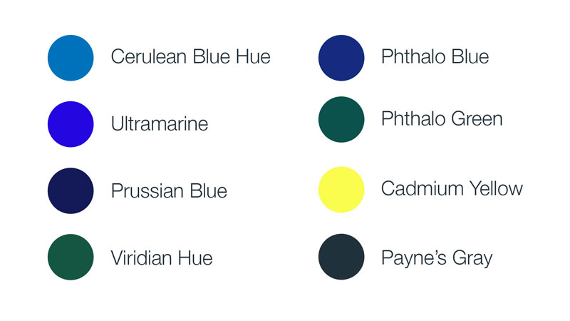
The painting that we’ll create features a variety of greens and blues. We’ll use a variety of pigments to create the teals and turquoises that we find in the waves and the muted sky. (Teal or turquoise is technically a blue-green.)
For the majority of the painting, we’ll stick with a combination of Cerulean Blue, Prussian Blue, and Viridian Hue. To adjust the values of these hues, we’ll use Payne’s Gray and Titanium White. Payne’s Gray is a dark, cooler gray that makes a great substitute for mixing over black. This is especially true in a painting like this where a cooler dark is required to create more natural, darker values.
Here’s a look at all of the pigments that are used (minus Titanium White)…
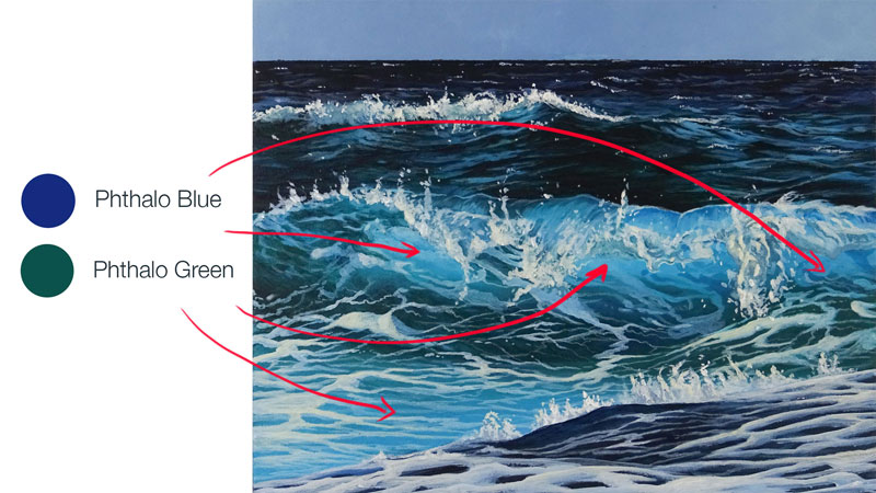
The dominant wave in the middle of the composition and areas just in front of it are much brighter and are slightly different in hue. We’ll need to mix a slightly different turquoise in order to be sure that this area contrasts with the areas around it.
To make a brighter turquoise, we’ll use a mixture of Phthalo Blue and Phthalo Green. To make this color the correct value, we’ll add a bit of Titanium White.
Here’s a look at the photo reference…
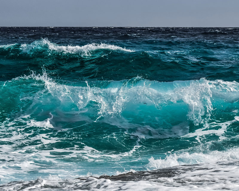
It’s important to note that with any drawing or painting that you create, you are not tied to the reference image. Our goal shouldn’t be to copy a photo. Instead, we should focus on creating a work of art – our own unique interpretation of the subject. We’ll use the reference image as a reference and use it to make decisions about values, shapes, and textures. But, we’ll also allow ourselves a bit of freedom and deviate from the reference as we feel necessary.

Planning Out Shapes of Color and Value
We’ll first plan the horizon and each of the larger sections of colors or waves. We shouldn’t be concerned with any details. Instead, we’ll simply draw loose lines with an “H” graphite pencil to indicate the locations of each of these features.
With these locations planned out with graphite, we’ll begin adding acrylic applications. We’ll begin with locations farthest away from the viewer and work our way forward.
The sky is quite muted and is addressed with a mixture of Cerulean Blue, a touch of Ultramarine, Prussian Blue, Payne’s Gray, and Titanium White. We’ll fill in the sky with a solid application.
Once the sky has dried completely, we can use painter’s tape to tape off the horizon line. This creates a nice, sharp edge where the water meets the sky.
Starting with the distant waters, we’ll begin applying dark blues. In the most distant areas, we’ll see mainly blues mixed with Prussian Blue and Payne’s Gray.
As we work to the upper middle of the picture plane, the blues become a bit greener. We’ll begin adding Viridian Hue to the mixture and allow the mixture to become a little lighter in value by using less of Payne’s Gray.
In the next section, working downward from the top of the picture plane, the values become lighter and the hue changes to a color dominated by Cerulean Blue.
In the extreme foreground, a dark wave slants diagonally across the bottom of the composition. This section is mixed with mostly Payne’s Gray with a hint of Prussian Blue.
Pulling Out The Distant Waves
After removing the painter’s tape, we can begin developing the illusion of distant waves. The illusion of waves, just like with any other subject, is dependent on the use of value. Value, or the darkness or lightness of color, creates the illusion of form and texture in a drawing or painting.
By positioning lighter and darker values, we can create the illusion of distant waves.
The darker and lighter brushstrokes applied for the distant waves are short and positioned close together, but as we work down the picture plane, they become larger with more space between them. In the middle ground, we begin to see clearly defined triangular shapes of darker tone with strong diagonal strokes of lighter value located on top.
It’s also important to note that as we work downward, we’ll use the hues that we established in the last step to create the lighter and darker values. For example, for the distant waves, we use Prussian Blue and Payne’s Gray, adding Titanium White for the highlights and Payne’s Gray for the shadows. But as we work to the middle ground, we begin to add Viridian Hue, adding Titanium White for the highlights and Payne’s Gray for the shadows.
Defining The Form Of The Waves
We’ll continue working with light and dark values to develop the illusion of the form of each of the smaller waves and ripples within the larger wave. As we continue to add slighter lighter and darker values, the form of the waves begins to take shape. This process of working the lighter and darker values is often referred to as “pushing and pulling”.
Once we have much of the upper middle wave defined, we can add a bit of sea spray along the top edge. To create this illusion, we can add a lighter version of the blue-green hue first, followed by progressively lighter values applied with a thicker application.
Establishing Colors and Values For The Middle Wave
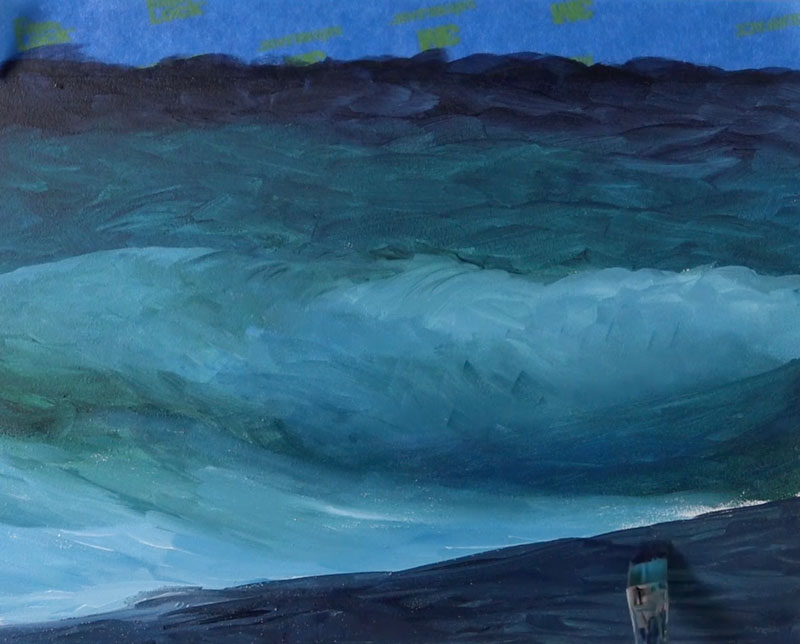
Now we’re ready to move on to the lighter wave which will ultimately become the main focal point of the painting. The light source is originating from above and slightly behind the wave. This means that as the wave breaks and becomes thinner at the top, some light makes its way in from behind. This produces lighter and brighter values towards the top of the wave.
The hues are brighter, more intense, and slightly different than the colors that surround this wave. As we mentioned before, we’ll use a different turquoise to address this area. This turquoise is brighter and will contrast with the blue-greens that surround it.
This brighter turquoise is mixed using a combination of Phthalo Blue and Phthalo Green and then lightened with Titanium White. As we begin adding this color and values of it, we’ll first concentrate on basic shapes. As we layer additional applications of paint with a smaller brush, the details will gradually emerge.
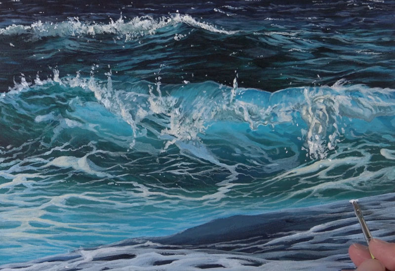
Adding And Refining The Details Of The Wave
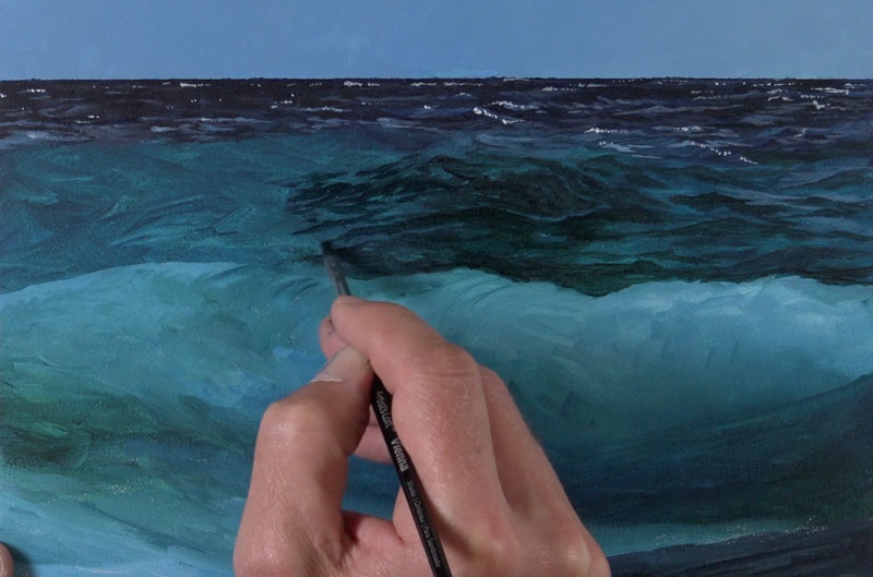
We can now go over the basic shapes of color and value and begin refining the details. This process mostly involves adding directional brushstrokes and indications of the meandering sea foam. We’ll continue to work the values and subtle changes in color as we go.
As mentioned earlier, the directional strokes produced by the brush play a role in how the waves are perceived. The water is moving and we want this feeling of movement to be evident in the painting.
In order to capture the movement of the water, we’ll change the directional strokes made with the brush according to the “flow” of the wave. We can see this concept illustrated below…
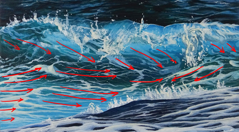
As the wave dips downward, the brushstrokes should also dip down. And as the wave moves upward, our strokes should do the same. Within the curve of the wave, the brushstrokes are mostly diagonal.
Directional strokes are also found on the top of the wave, as it gently folds over on itself. These brushstrokes contrast the diagonal strokes on the inside of the wave.
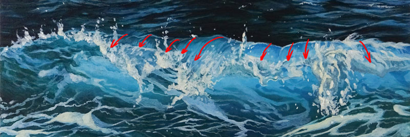
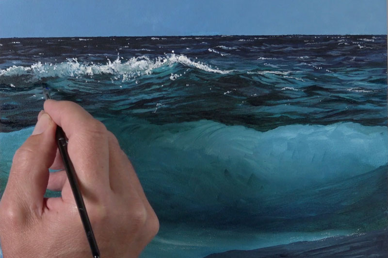
As we did with our first larger wave, we’ll add the sea spray right along the edge of the top of the wave. Notice how much this sea spray changes in shape, value, and color as it makes its way down the break.
To make the lightest areas of the sea spray stand out more, we’ll add just a touch of Cadmium Yellow to Titanium White. This subtle addition of yellow increases the contrast against the cooler blue-greens and gives an indication of the warmth of natural sunlight.
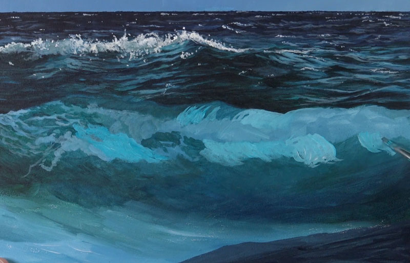
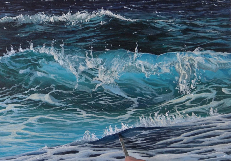
Painting The Sea Foam
The sea foam is painted using both a small flat and round brush. Mostly horizontal and slightly diagonal strokes are pulled across the form of the wave. A thinned mixture of blue-green is added first before being intensified with additional layers of progressively thicker paint. Within the curve of the wave, the values are slightly darker, but just outside where we run into some light, the values become lighter.
Just as we did with the sea spray, we’ll add a touch of Cadmium Yellow and go over a few areas to add a bit of warmth and contrast.
Painting The Wave In The Foreground
The wave found in the extreme foreground is much darker and bluer, but this doesn’t change how we approach developing the sea foam here. We’ll still apply a thinned application of Titanium White, but with a larger flat brush initially. A smaller round brush is used for the smaller strips of sea foam in between.
Over the top of our thinner applications, we’ll apply opaque applications of Titanium White. Then, like we did with the sea spray and the bits of sea foam in the middle ground, we’ll add a touch of Cadmium Yellow to the mix to make the color a slight bit warmer and make it contrast with the cooler blues.
Finishing Things Up
We’ll add a section of sea spray right along the upper edge of the wave that is closest to the viewer. Again, we’ll start with a thinned application and then become more opaque to create a range of value and create the illusion of form.
We’ll again add a touch of Cadmium Yellow to outer edges of the sea spray. To add a bit more contrast, we’ll darken the wave just behind the sea spray.
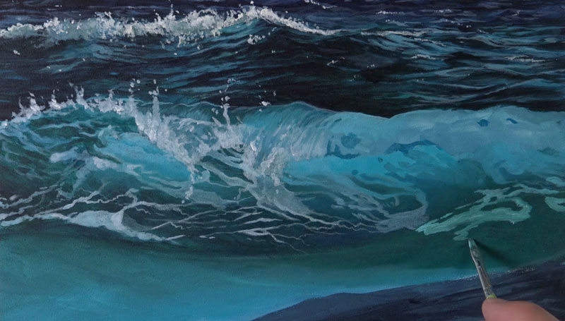
We’ve now patiently worked our way down the picture plane and our painting of waves with acrylics is complete. We’ve been patient, applied brushstrokes in a manner that makes sense with the movement of the water, and matched values as closely as possible. But at the same time, we’ve created a painting that isn’t a duplicate of the photo, but instead a work of art that is unique and interesting on its own.
If so, join over 36,000 others that receive our newsletter with new drawing and painting lessons. Plus, check out three of our course videos and ebooks for free.

Lesson Discussion
Comments are closed.
This is the most beautiful seascape I have seen. The demonstration was spot on, easy to follow and full of advice – as usual. Can’t wait to get started, but since it is 12.05 a.m. here in Portugal maybe I should get in some sleep first!
Thank you Matt for a very inspiring video.
what a great lesson – loved it thankyou
Danke Matt für das Video, leider habe ich kein Wort verstanden…
ich verstehe kein english.
loved it, thank you.
Thank you. Your painting lesson ( waves) is very timely.
I cannot take the time to follow your lesson just now. Employment gets in the way!
Maybe to night.
Loved it! Does the same technique work with oil paints?
Yes, absolutely!