
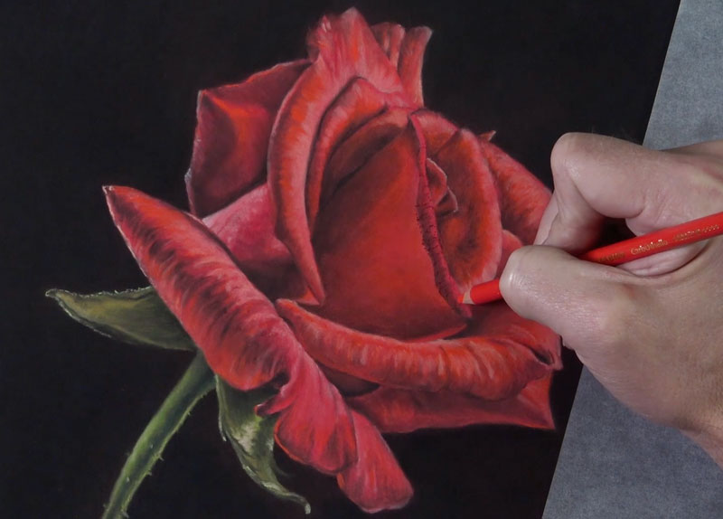
This first lesson describes the process of drawing a rose with pastels. A second lesson is included on this page on drawing a rose with colored pencils. You can skip to this lesson using the following link…
Let’s dive in…
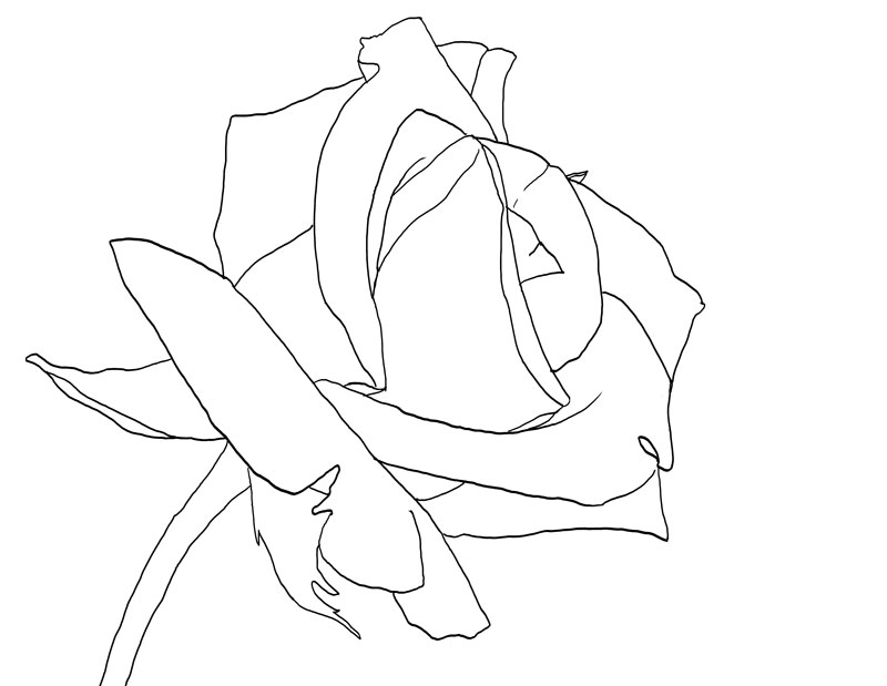
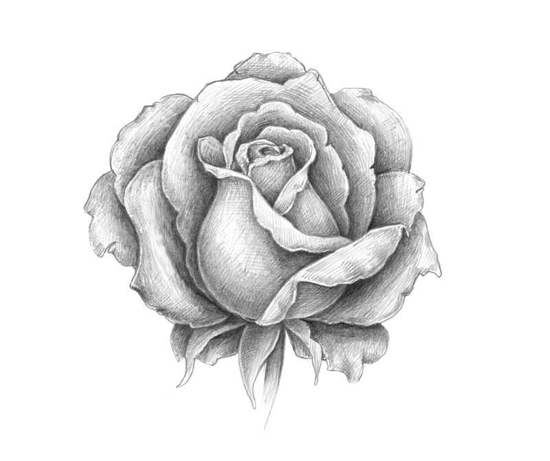
Rose Outline
For this demonstration, we begin with a simple contour line drawing of the rose. This line drawing can be drawn freehand or you may choose to transfer the outline of the rose directly to the drawing surface.
If you want to begin with the same contour line drawing that was used for this lesson, I’ve provided a template of the rose outline for you to use below.
If you want to learn how to draw a rose from imagination, you will need to practice drawing it from observation. So if this applies to use, it’s best to skip using the outline.
You may also draw directly from observation using this template if you prefer…
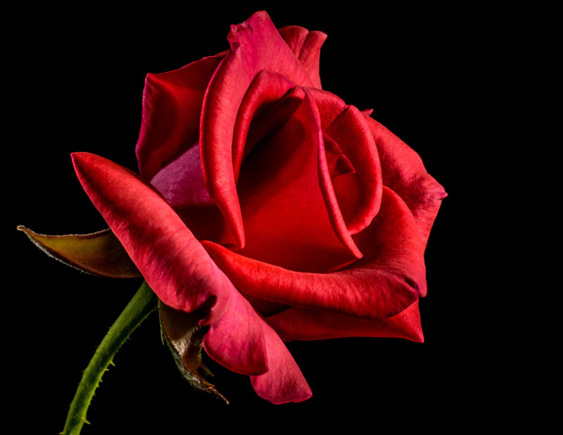
Rose Photo Reference
The photo reference we’re using for this lesson is from pixabay.com, a wonderful resource for royalty-free images submitted by users. I have manipulated the photo slightly by reversing the image and played around a bit with the contrast. Here’s the reference photo…
Suggested Materials
This lesson features the use of several forms of pastels as well as several different brands. You may, of course, use any medium that you wish. The concepts that we explore here are fairly universal and can be applied to any drawing medium that you wish. But, before dive into those concepts and take a look at the step by step approach, let’s discuss the materials used here.
PastelMat Paper
The surface we’re using is PastelMat paper (See my review of this paper). This paper is specifically branded and designed for pastel applications, but any drawing medium can be applied to it. The surface is relatively smooth compared to other pastel surfaces. This makes it suitable for subjects where smooth gradations of tone and value are a must. Even though the surface is fairly smooth, it still has enough grit to accept multiple, layered applications of pastel – which is important for any pastel drawing that you create. It is available in various tones.
The paper features one side suitable for mark-making and is supported on the backside with a waxy, thick backing. Each sheet includes its own cover sheet which also doubles nicely as a protective barrier while working on the art.
Rembrandt Pastels
Rembrandt pastels are artist-grade pastels that are used by professionals. They are quite rich in pigmentation and are available in just about any color you can imagine. The pigmentation does affect the behavior of the pastels. Some colors are more difficult to layer over, while others are covered with ease. This characteristic steers some artists away from this brand. However, after using several different brands of pastels over the years, these are still my favorite.
Conte a Paris Pastel Pencils
These artist-grade pastels are very pigment-rich. They are extra-soft, spreading strong color as they are applied. They easily cover applications underneath and are blended with ease. They are a bit pricey, and their life is relatively short (since they are so soft). The pencils are thicker than ordinary pencils, so a larger pencil sharpener may be used. They can also be sharpened with blade (which is how I prefer to sharpen them). They are so soft that they are easily broken during use. However, this trade-off is relatively minor since the quality of the mark is exceptional.
CarbOthello Pastel Pencils
While the softer Conte a Paris pastel pencils are great for coverage and some of the details, the CarbOthello chalk pastel pencils handle the details with more precision. These pencils provide excellent control, which can be difficult to achieve with pastels in general. They are harder than some of the pastel pencil options, but this characteristic is also what makes them great for precision. They are the size of a regular pencil, so sharpening them is a breeze with a regular pencil sharpener.
How to Draw a Rose Step by Step
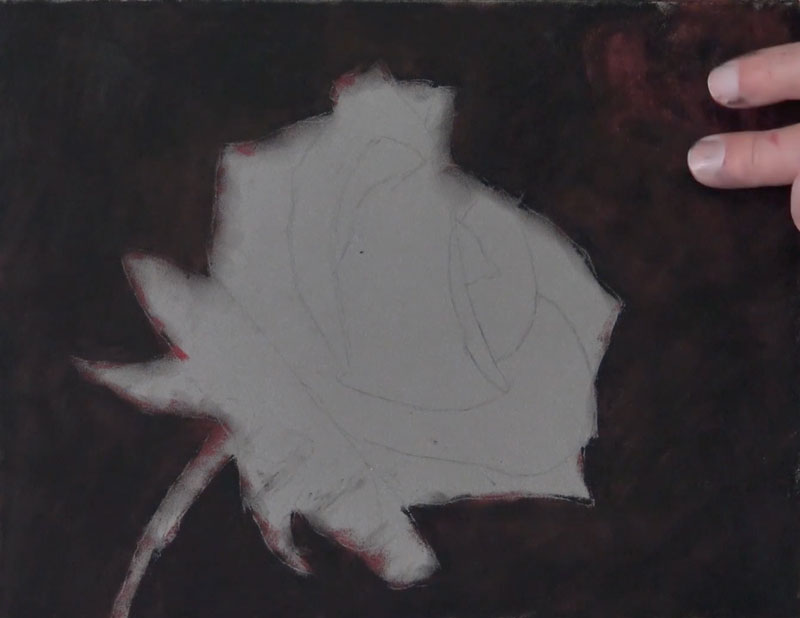
Now, we’ll look at the step by step process and how to draw a rose with pastels. As mentioned before, we begin with a simple contour line drawing (or graphite transfer). It’s important to avoid placing too much pressure on the tip of the graphite pencil when creating the line drawing. It’s easy to create indentations in the PastelMat paper which will be visible when applying the softer pastels.
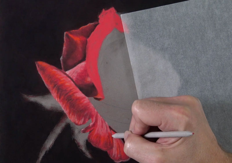
After the line drawing is in place, we’ll start addressing the background. Since we can cover pastel applications with additional pastels, it makes sense to work from the areas farthest away from the viewer to the foreground. We’ll begin with an application of black and cover the entire background space. Black on its own, however, is very strong and can make a color drawing or painting appear flat and unnatural. In this case, we want to create strong contrast between the rose and the background, but we still need the image to appear natural.
To preserve a strong contrasting background while keeping a natural appearance, we’ll apply a dark red over the black applications and blend them with a finger or blending cloth. After applying the dark red, an additional application of black is applied and blended. The result is a dark background that maintains a hint of color.
Drawing the Rose Petals
For this image, we’ll address each petal of the rose individually. You could address the rose as whole if you prefer, but since we’ll address each petal with the same set of colors we’ll still create a sense of unity approaching the subject in this manner.
Just as we considered the background as the area that is farthest from the viewer, we’ll approach the petals in the same way. We’ll begin with the petals that are the farthest away and work forward. The only caveat to this is the positioning of your hand. If possible, we want to avoid laying the palm of our hand over areas of the drawing that we have already addressed. This means that you may have to skip around in the drawing, and abandon the “front to back” approach for some the petals.

We’ll begin our first petal with a solid application of a base red. It’s a good idea to choose a base color that is close to a middle value. This allows us to “push” the values for each of the petals either darker or lighter to create the illusion of form and texture. By using the same base color throughout the drawing, we also ensure a bit of harmony.
After the base color is in place, we can layer both warm and cool reds of slightly different values over the top.
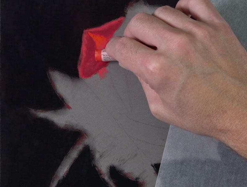
We can add a bit of black with a pastel pencil to push the darker values and subtle shadows on our first petal. These applications are then blended with a blending stump. Be sure to blend the applications using directional stroking that matches the texture of the petal. The PastelMat paper provides a great surface for work with blending tools, providing a bit more precision.
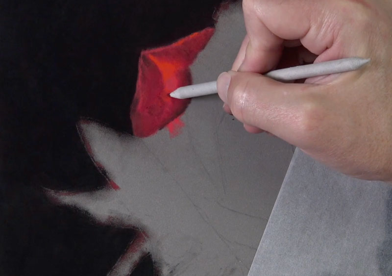
We’ll continue to gradually push the value range and increase the contrast with additional applications of black over the red underlayment. We’ll also add a few strong highlights with a pink and light peach pastel pencil, before blending again with the blending stump.
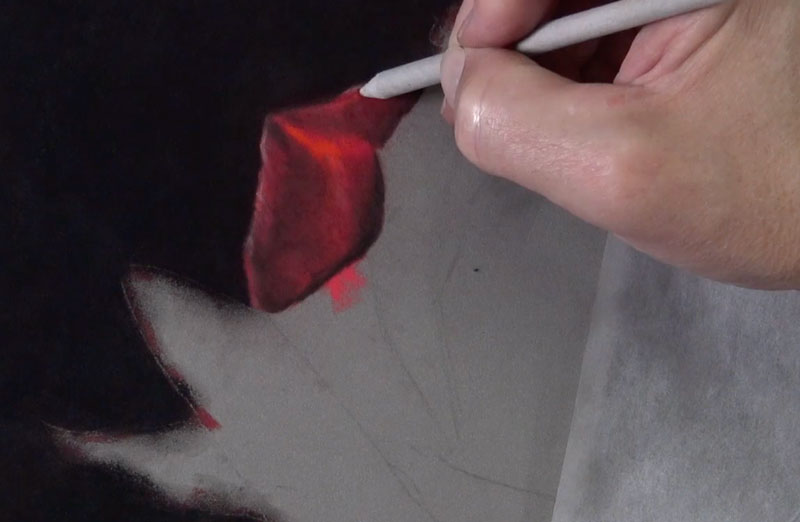
With our first petal in place, we have a set of colors and a repeatable technique that we can use on the remaining rose petals. By using the same colors and the same approach for each of the petals, we ensure consistency and create harmony in the drawing.
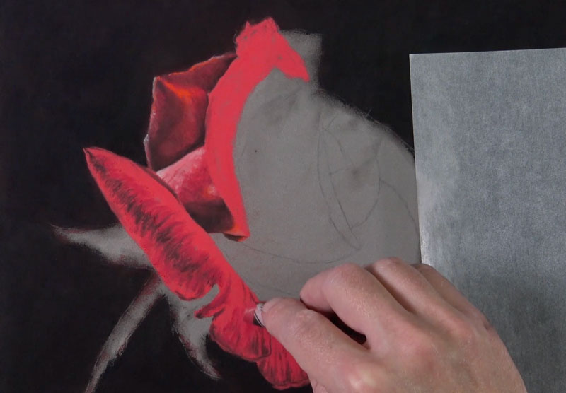
We’ll next continue to the next set of rose petals that overlap the first. Remember, we’re also considering the placement of our hand as well. Since I’m right-handed, I’ll stay primarily on the left side of the drawing as long as I can to prevent any unwanted smudging.
Again, this is the process that we’ve developed…
- Lay down the base red with a solid application.
- Apply cool and warm reds of various values.
- Adjust dark values by applying black.
- Add highlights with lighter red (pinks and red-oranges).
- Blend layered applications with a blending tool.
As we progress through these steps, we’ll also continue to consider the directional strokes that we make. These strokes, often referred to as “cross contour lines“, should flow over the form of the petal. This means that the directional strokes will change direction for each new petal and most circumstances, change direction within each petal.
Drawing the Stem and Leaves
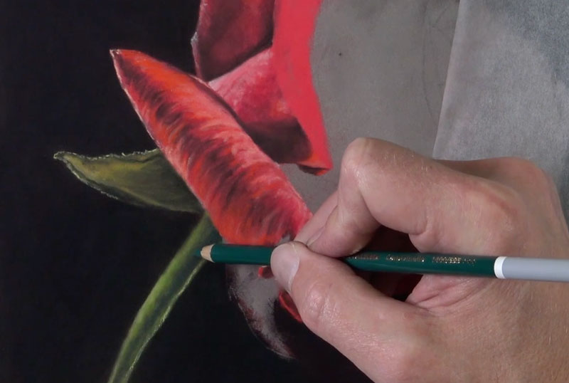
We’ll take a break from drawing the rose petals for a moment and address the stem and the leaves. Even though this section is different in color, we’ll still use the same technique for developing the form and texture.
We’ll start with a base application of yellow-green using a pastel pencil. I would suggest staying away from greens that are dominated by blue for the base application. (Blue-dominated greens can appear unnatural when used for leaves and stems, although we’ll still use a blue-green for portions of the core shadow on the stem.)
Once the base application of yellow-green is in place, we can develop the darker values with black and the lighter tones with a lighter, earthy yellow-green. Each layered application is blended with the blending stump.
On the stem, the same colors are used with the exception of a darker, blue-green which is added in the area of core shadow. Notice that since we have two light sources, the core shadow is found near the center of the stem. We see highlights, addressed with light yellow-green, on either side of the body of the stem.
Continuing with the Rose Petals
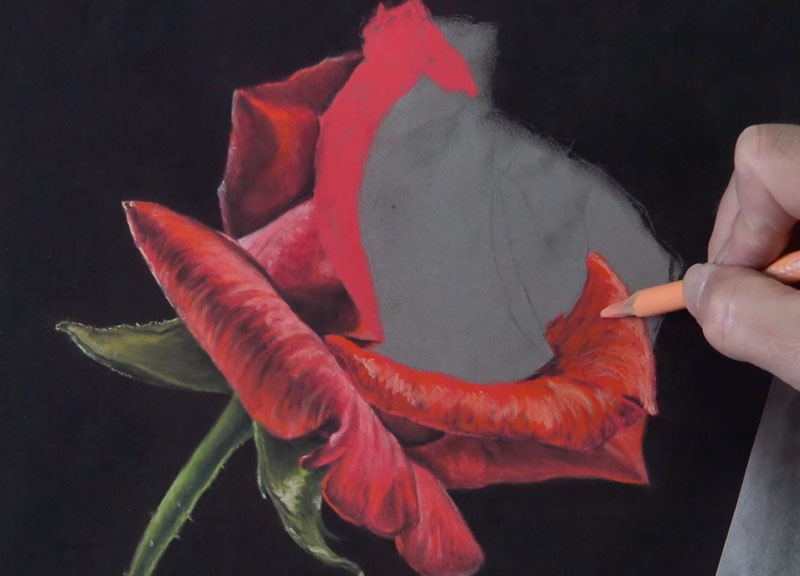
With the leaves and stem in place, we’ll go back to developing the rose petals. As we work closer to the dominant light source, on the right side of the picture plane, we’ll begin adding more of the warmer reds and less of the cooler ones. Most of the cooler reds exist mainly on the left side of the rose.
We’ll also use more of the lighter red-oranges (peach) to address the highlights.
As we develop each petal, we’ll gradually work our way to the center. Take note of how the large, exposed side of the petal pictured below is rather smooth in surface texture. Instead of leaving defined strokes, as we have thus far, we’ll smooth these applications with the blending tool to reflect the texture observed.
At this point, only a few rose petals remain. But before addressing the very center of the rose, we’ll add the petals on the extreme right side of the flower. These petals are developed first, since the center of the rose overlaps them.
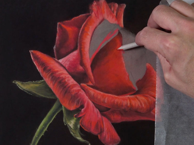
We’ve finally made it to the center of the rose. Now we’ll just draw in the last remaining petals. We’ll continue to follow the same approach – using the same technique with the same order of colors.
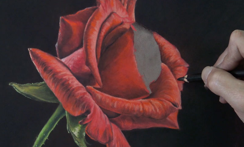
The drawing is almost complete. Just a few finishing touches remain. We’ll next address the small portion of the petal that overlaps near the center. This area is rather small, so after the base color is applied, only pastel pencils are used to develop the value.
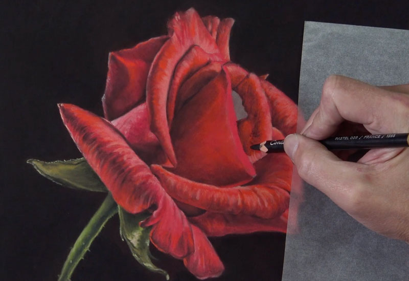
Cleaning Up the Drawing
Like with any pastel drawing, some excess dust will inevitably find its way into areas that you did not intend. While we make efforts to clean things up as we go, we may find that we need to tidy up the drawing further when we’re complete. In this case, quite a bit of pastel dust has made its way into the darker background. In order to preserve the strong contrast, we can use a finger or a blending cloth to blend this excess dust away.
To refine the edges of the rose, a black pastel pencil is used where a finger would do more harm than good.
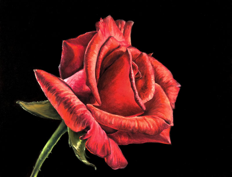
Now, our drawing of a rose with pastels and pastel pencils is complete.
Next we’ll take a look at a step by step break down of drawing a rose with colored pencils…
This lesson has been prepared by artist, Eugenia Hauss.
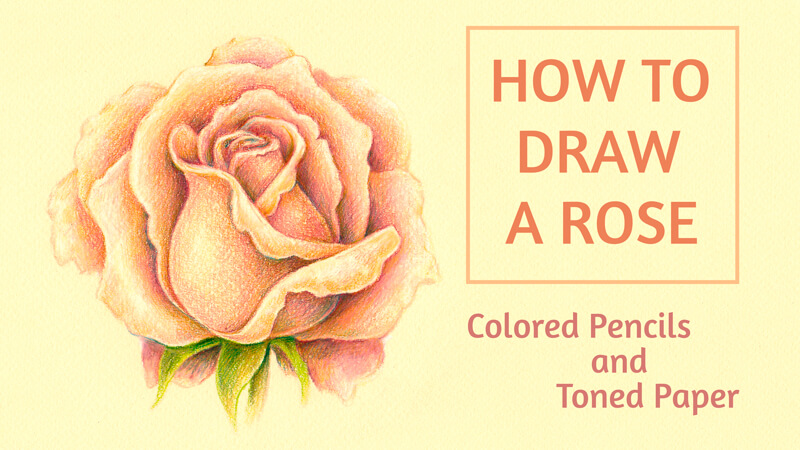
In this lesson, we’ll take a look at how to draw a rose with colored pencils.
We’ll explore the possibilities of toned paper. If you’re new to this theme, here’s a great article that will guide you through the advantages of drawing on toned paper…
Six Reasons to Draw On Toned Paper
For this drawing, I’ve chosen a sheet of pastel paper. It has a delicate yellowish tint and a subtle texture. The selected colored pencils will harmonize with the color of the paper.
The goal of my project is to create a beautiful drawing (or, if we put it more precisely, a sketch) of a rose. Such experiments can be a fun thing to do – and they don’t require much time to complete. Also, it’s possible to consider this project as preparation for a larger and more ambitious artwork on toned paper, if you like.
The Materials for Drawing a Rose on Toned Paper
My drawing is small. I’ll use about a half of a standard A4 paper size for it. The color of paper is called “Vanilla” and this name is quite appropriate for this light yellowish tint.
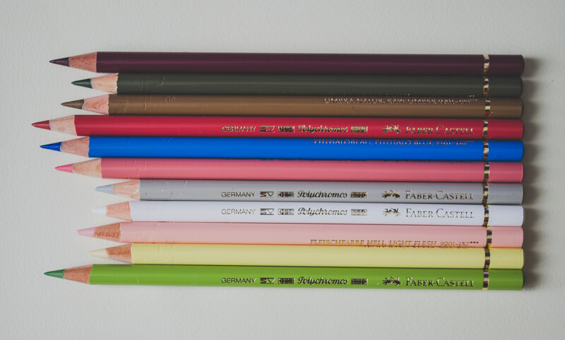
The colored pencils I’ll use are from the Faber-Castell Polychromos set (please feel free to use any pencils you like). I usually preselect a range of colored pencils that seem to be a nice fit to the idea in my mind. This limitation helps to unify the drawing.
The pencils for this project are:
- Red-Violet
- Olive Green Yellowish
- Raw Umber
- Pompeian Red
- Phthalo Blue
- Medium Flesh
- Warm Grey II
- White
- Light Flesh
- Cream
- May Green
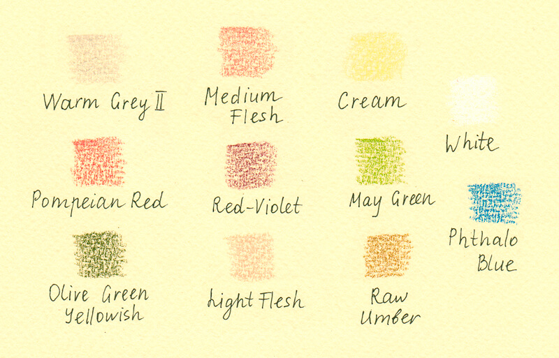
It’s useful to try out the selected pencils on a piece of paper that is the same or very similar to the one you’ve chosen for your project. Colored pencils create a semi-transparent covering, so the color of paper influences the result greatly.
Plus, keep in mind the texture of our paper. Since the paper is textured, it will play a role in the finished result.
Also, I recommend keeping a sharpener at hand. Sometimes having a sharp tip of the pencil is crucial, especially if you’re working on the fine details or outlining any contours.
For the graphite sketching part, which is the next step below, we’ll need a pencil – or a couple of them, for example, HB and 3B – and an eraser.
Drawing a Rose with Graphite Pencils
Completing this step isn’t required of course. Feel free to skip it if you prefer to start drawing with colored pencils right away. But keep in mind, it’s helpful to “study” your subject with a quick sketch before committing to colored pencil applications.
I’ve decided to create an improvised guideline that will help me in the creation process. I’m going to create the general design of petals and allocate values before picking up a colored pencil.
A rose may seem intimidating to draw – it has many bending petals that curve slightly and fold in different directions. However, this task is not that complex. Just remember that the petals are organized around the center of the flower.
It’s useful to study a live rose to grasp the subtle value transitions and structure of this subject. In the case with roses, studying nature may work more efficiently than trying to figure out the important nuances through a photo reference.
To simplify the task, you may decide to begin with a stylized outline. First, I mark the shape of the rose’s inner portion, which looks solid and resembles the top part of a wine glass. With this central element in place, we can arrange single petals around it.
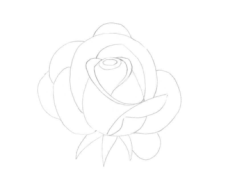
Now let’s refine the outline by changing the contours of the petals and erase any unnecessary lines.
Feel free to change the initial sketch or add new elements. As I made refinements to the sketch, the petals of my rose became more angular.
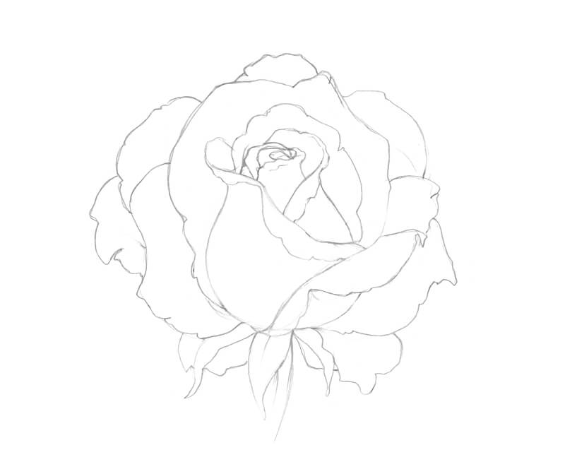
With an HB pencil, I start allocating the values. I use both hatching and soft pencils marks, which are made with circular motions of my hand. If lines repeat the contours of an object, it gives the drawing more volume. The circular strokes are especially great for conveying the beautiful, velvety texture of the petals.

I increase the contrast gradually, working with both HB and 3B pencils. The areas between petals, where the cast shadows are found, become noticeably darker.
The bending parts of the petals remain lighter in value. I leave the tips of the petals almost untouched.
Now, as the tonal sketch is complete, I feel confident in my vision of the future colored pencil work I’ll create. However, this part of the process is simply preparation.
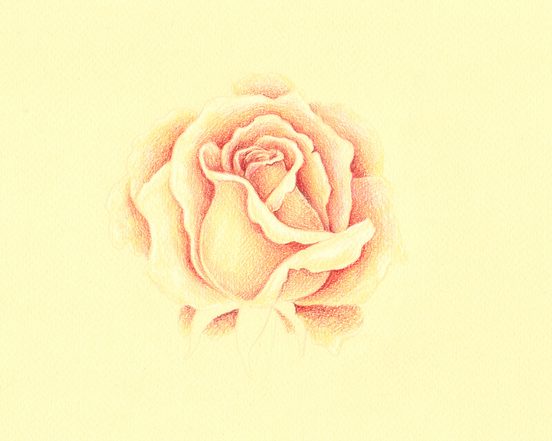
Drawing a Rose with Colored Pencils
I transfer the main contours of the rose to the pastel paper sheet, using the window as a light board. The daylight is our friend!
The lines are very light, made with Warm Grey II. I avoid applying any graphite pencil marks to the pastel paper because it may smear and contaminate the subsequent colored pencil applications.
Also, I mark the darker areas of the flower, using Medium Flesh. I continue to refer to the graphite sketch to make decisions regarding the locations of the values.
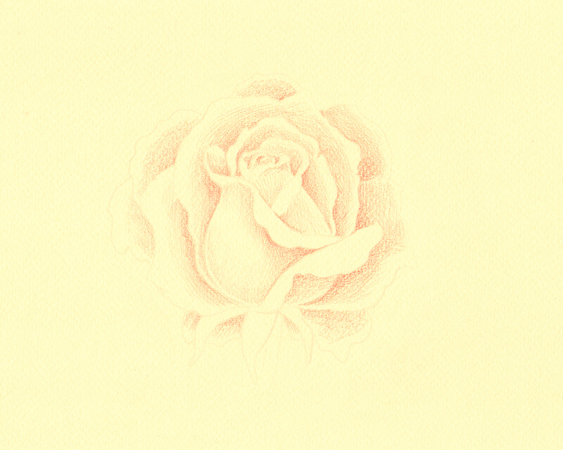
With Cream, I create a base of the light yellowish tint. It also softens the transition between the existing pencil applications and the color of the paper itself.
However, I leave some gaps of untouched paper here and there, especially on the tips of the petals.
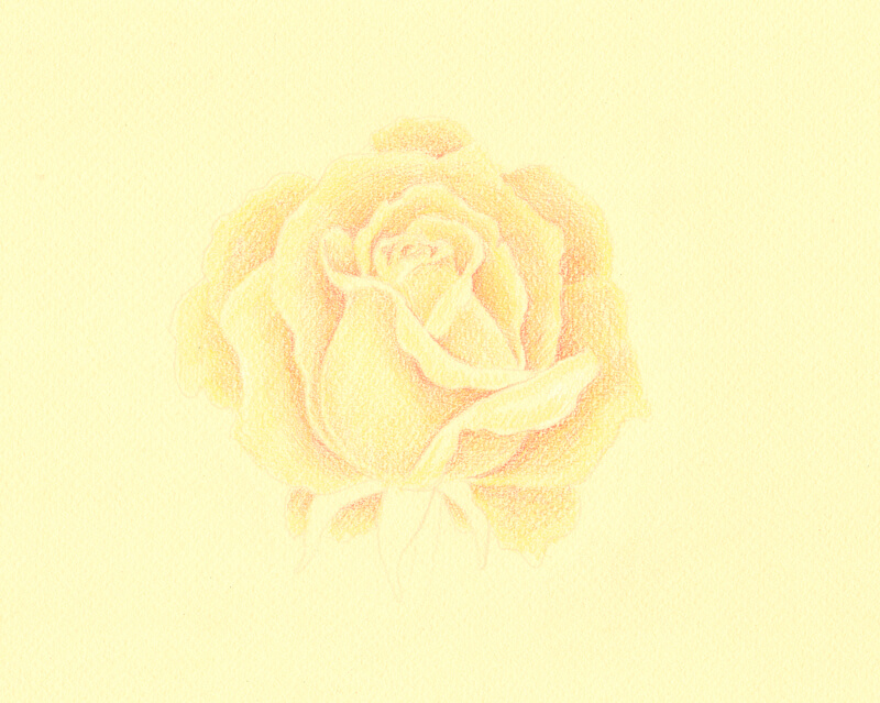
With White, I lighten the tips and the bent portions of the petals. I keep a medium pressure on the pencil, but avoid pushing too hard as it may damage the tooth of the paper.
Also, I increase the contrast just a little by applying Pompeian Red to the darker parts of the rose. These applications are soft and light, but add a touch of color.
I add some Red-Violet strokes, which is a darker color. I use only the tip of the pencil which is very sharp, only to the darkest areas of the drawing.
It’s time to work on the green sections of the rose. I develop them with May Green as a base color and use Olive Green Yellowish to accent shadows.
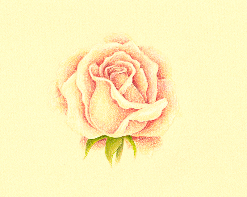
I carefully burnish the petals with Light Flesh, applying the light color on top of existing pencil marks with circular motions with medium pressure. I also add a bit of this color to the green elements to create visual harmony.
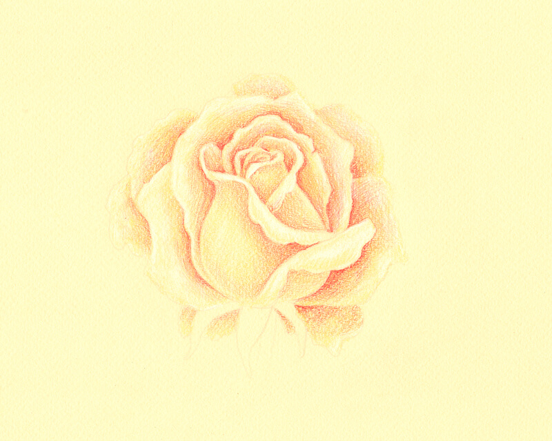
If any details are lost while burnishing, it’s possible to restore them with Red-Violet or Pompeian Red.
I evaluate my drawing. It looks nice, but I’d like to give some more warmth to the petals. So I add natural brownish touches with Raw Umber, keeping light pressure on the pencil.
My intent is to suggest a warmer hue in the areas that are close to the shadows. I also add this hue to the greens.
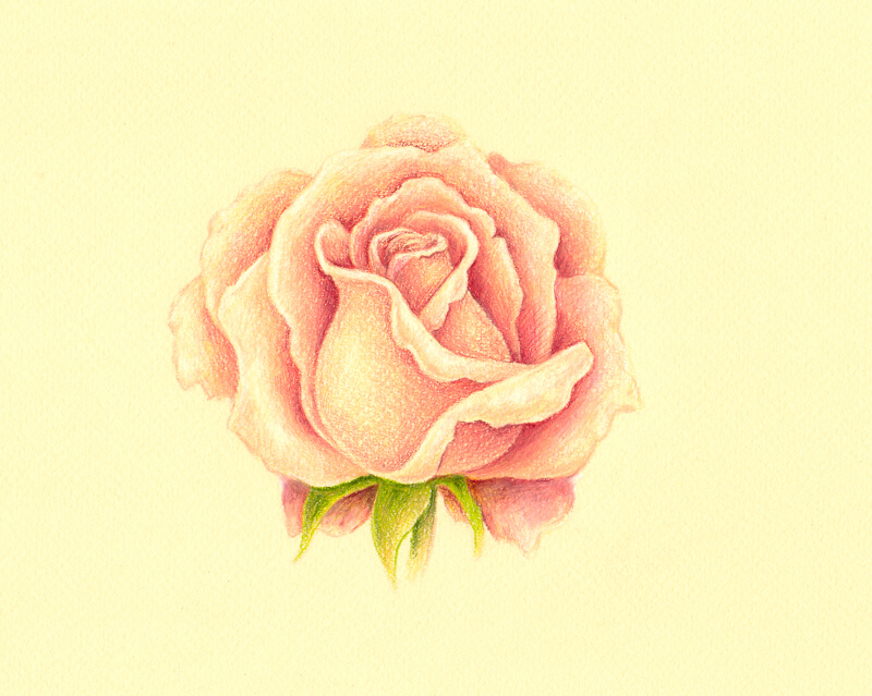
If any applications of Raw Umber become too strong for our delicate drawing, I dilute them with Medium Flesh. Or, if there is a need to lighten them a bit, burnishing with a light tint (for example, Light Flesh or Cream) does the trick.

To deepen the shadows, I carefully add just a bit of Phthalo Blue to the darkest areas of the drawing. This creates more contrast and makes the drawing vivid!
Summing it Up
I’m happy with the result of my rose drawing. I think it’s a beautiful colored pencil sketch and reminds me of vintage floral postcards. And, completing this piece took little time, thanks to the tint of the paper that provided us with the base color and saved us a lot of effort.
Conclusion
Now we’ve had a look at how to draw a rose with pastels and colored pencils. The process is similar with any medium that you choose to use. Just remember to avoid getting overwhelmed with all of the folds and details. Take the process slowly and you’re likely to be successful.
If so, join over 36,000 others that receive our newsletter with new drawing and painting lessons. Plus, check out three of our course videos and ebooks for free.

Lesson Discussion
Comments are closed.
Thank you Matt.Stunning rose.I love the play in values creating the delicate velvety texture that the rose possesses.