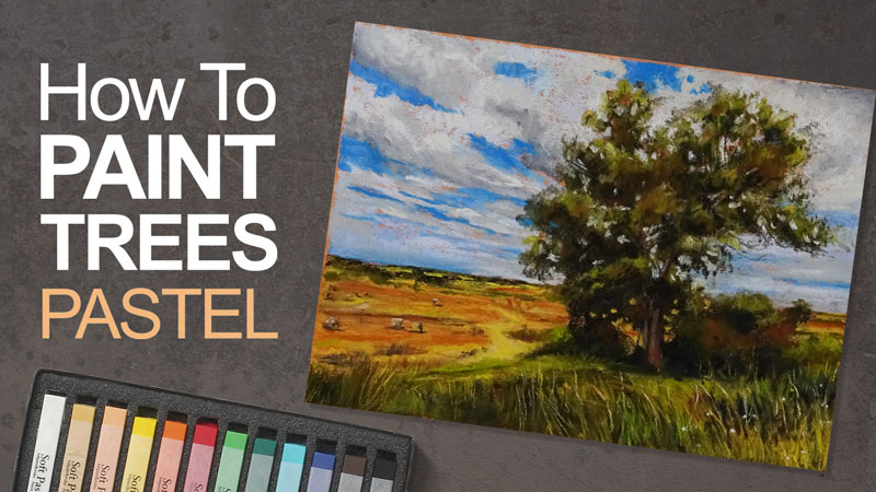
In this pastel lesson, we'll take a look at creating a loose drawing of a bright autumn tree. We'll create an underpainting of pastels that is activated with an application of acrylic matte medium. This approach allows us to develop some of the darker values quickly, providing an excellent base to layer stronger and brighter colors on top.
Soft pastels are produced by many art manufacturers. Quality and price varies greatly. If you're just getting started with pastels, a less expensive option is produced by Reeves. Although this brand of pastels is not considered a "professional" choice, it is still capable of producing rich colors with effortless blending.
(Some of the following links are affiliate links which means we earn a small commission if you purchase at no additional cost to you.)
In this drawing, our goal is to produce a quick and loose depiction of an autumn tree. While some details are important, they are not emphasized with this approach. Instead, we'll focus on the color and value relationships and allow them to be the driving force of the sketch.
We'll concentrate on the shapes of value and color that we see and make deliberate strokes with the pastels to mimic our observations. But before we apply these bold strokes of color, we'll need to develop an acceptable base by creating an underpainting.
We'll first lay down a few of the observed colors. A darker gray and Burnt Umber is used for the trunk of the tree while pinks, oranges, and yellow-greens are applied in the background.
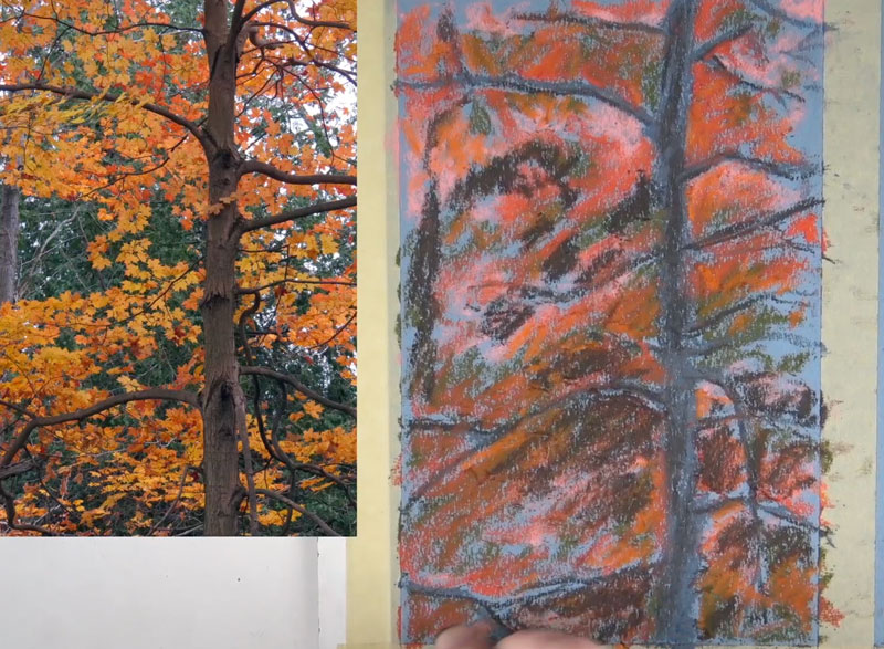
An "underpainting" for a pastel painting can take many forms. It can simply be blended applications of color or a simple monochromatic value study. In this demonstration, we'll use acrylic matte medium, applied with a nylon brush, to dissolve our initial applications of color. Water or alcohol can be substituted to create a similar effect, however these additives can wrinkle the paper. Matte medium dries very quickly and wrinkling is minimal.
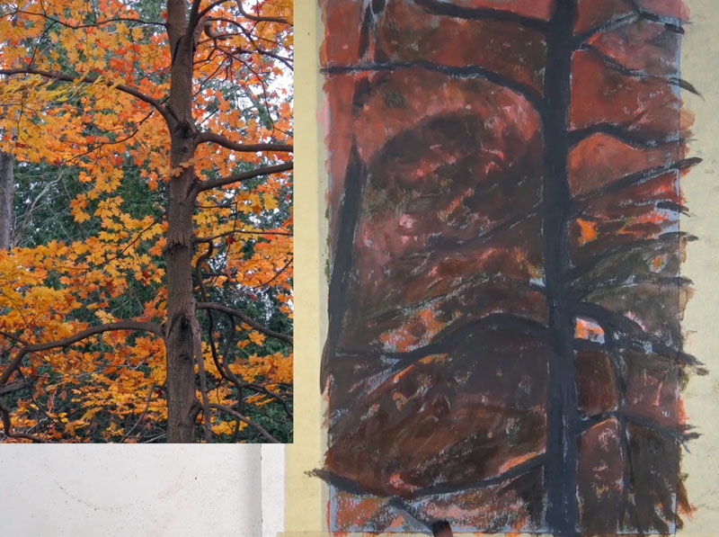
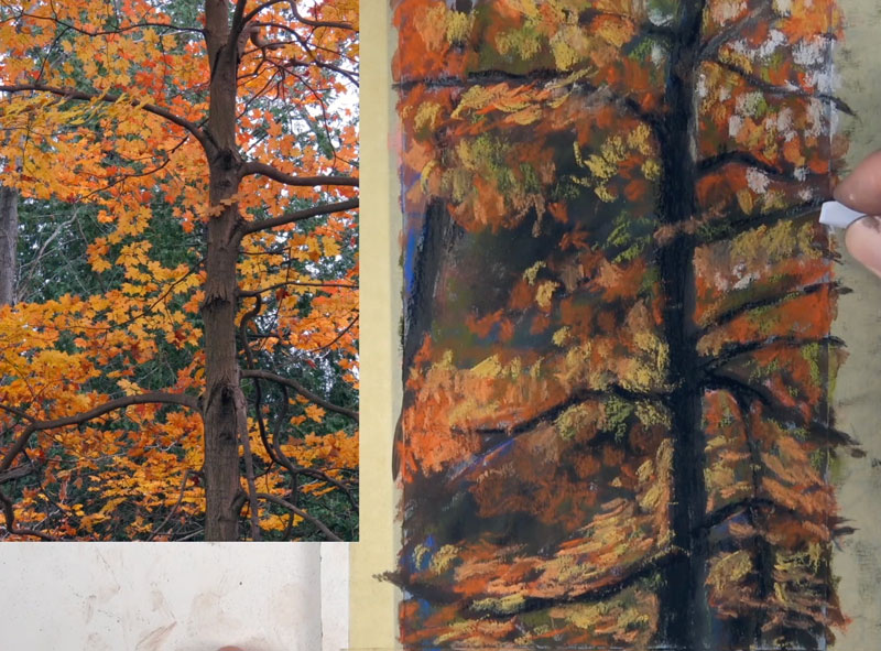
After the underpainting is in place, we can begin the process of layering stronger and bolder pastel applications. In this case, our underpainting is rather dark. This is acceptable since we are building lighter values over the darker ones. Since much of our darker values are in place, we can now concentrate on slowly building in the lighter tones, increasing the contrast while building a full range of value.
We can also add darker tones if the value needs to be pushed darker in areas. In this case, a bit of black is required on the shadowed side of the tree trunks and in a few areas in the background.
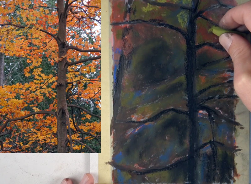
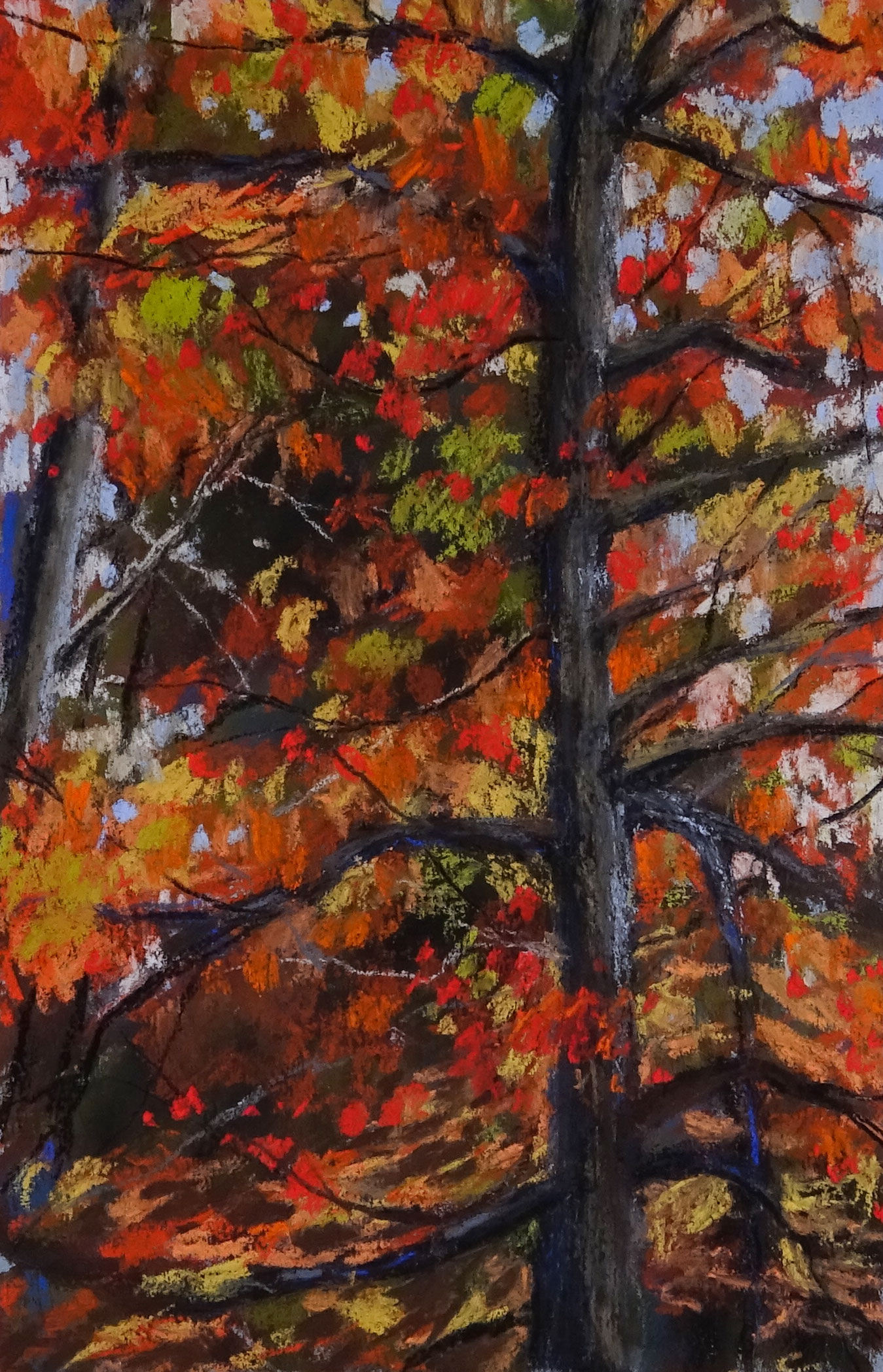
Gradually, we can begin bringing in some of the brightest colors. A variety of oranges, red-oranges, and yellows are applied. A bit of Utramarine is added in places to increase the color contrast and vibration with the oranges. The red-orange also contrasts nicely with yellow-greens added in areas.
Bits of the sky are peaking through the canopy in areas. A very light blue is applied using vertical strokes, mainly at the top of the composition.

We can continue increasing contrast between the colors within the scene that are complementary, meaning that they are directly across from each other on the color wheel. These color combinations include the oranges and blues and reds and greens. We'll continue adding bits of these colors to increase the vibrancy.
In addition, we'll add some hints of detail in the form of smaller branches. These smaller branches reach out in horizontal directions, breaking up the vertical strokes of the leaves. A hard, black, Nupastel is used for the majority of these branches, while a lighter gray is used for some of the branches of lighter tone.
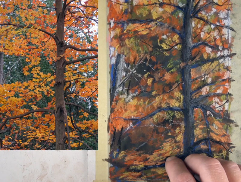
Our completed drawing is loose, vibrant, and active. The freshness of the unblended marks contribute to sense of movement in the work, where color and contrast are the stars.