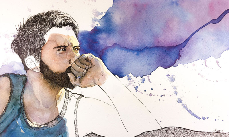
The loose spontaneity of watercolor contrasts nicely with the defined and controlled quality of the line art produced by pen and ink. Many artists choose to combine these mediums for this very reason. What the watercolor lacks in control and definition, the pen and ink more than makes up for. The reverse of this is true as the watercolor adds life and color to an otherwise descriptive but potentially "cold" pen and ink drawing.
(Some of the following links are affiliate links which means we earn a small commission if you purchase at no additional cost to you.)
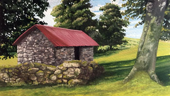
Any surface that is capable of accepting watercolor washes is suitable for this form of mixed media. Some papers are better suited for the watercolor applications while sacrificing some control of the marks made with the pen. These papers include traditional coldpress watercolor papers like the surface used in this lesson. These papers tend to be more textured, which is great for absorbing water but can add texture and inconsistency to the marks made with the pen.
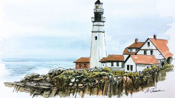
Conversely, some papers are better suited for pen and ink but may limit the amount of water the artist can use for the watercolor applications. These papers or surfaces include illustration board or hotpress papers.
Either type of paper can be used. It's up to the artist to decide what they want to emphasize in the work. If you are planning to emphasize the watercolor washes, then a coldpress textured paper may the best option. If you want to emphasize the pen and ink line art, then a smoother surface may be the best choice.
Although there are no rules for art creation, there are a number of principles that are generally accepted. A strong composition typically will feature at least one focal point, although several can be included. In this work, several strategies were implemented in order to develop a strong focal point.
With any portrait, the eyes will always demand the attention of the viewer. We, as humans, are naturally drawn to the eyes of another human. In this work, we have a natural focal point just by including eyes.
We can also create a focal point by intersecting guiding lines. Guiding lines can be actual lines or subtle indications of a line made by a shape or a color. These lines help to move a viewer's eye through the work of art. In many circumstances, we may use guiding lines to encourage eye movement through the work. When these guiding lines intersect, we usually create a focal point.
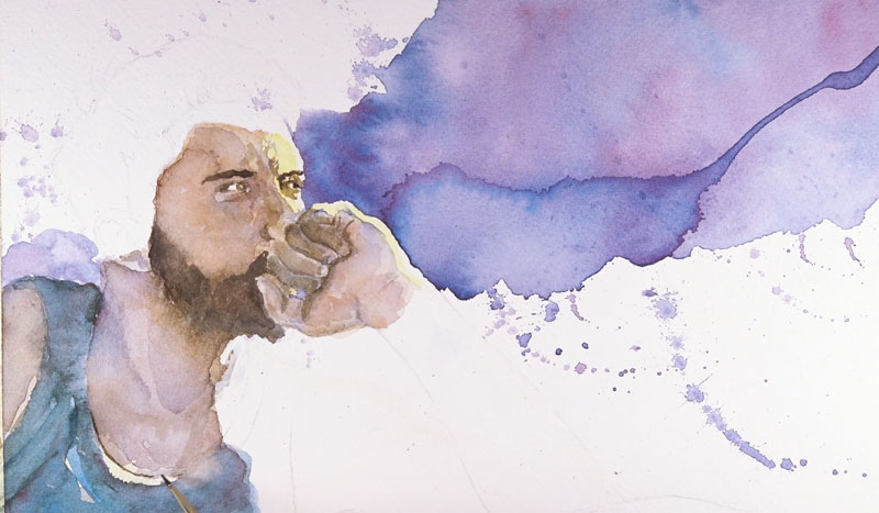
In this work, our eyes are guided by the watercolor applications which form a diagonal through the middle of the work, but more importantly, through the eyes. We also are guided by the forearm of the figure which intersects the "watercolor diagonal". This intersection happens near the eyes, reinforcing the focal point.
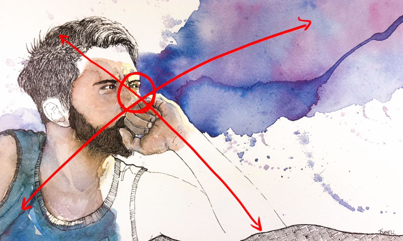
We also can use contrast to pull a viewer's eye to a specific location. In this work, light yellow highlights are positioned right next to the darker, purple color of the background. Not only does the value contrast, but also the colors. Yellow and purple are complementary colors which are directly across from each other on the color wheel.
Creating a strong focal point in your work is important, but the location of the focal point should also be considered. While we can create a focal point anywhere that we like on the picture plane a few locations prove to be more successful than others. We can ensure that our focal point is placed in an aesthetically successful location by using the rule of thirds.
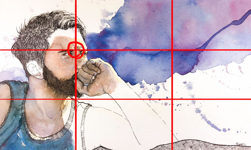
If we sub-sect the picture plane into thirds and draw lines where these divisions take place, we can find four intersecting locations. Placing a focal point on any of these intersections usually results in a more aesthetically successful composition.
A light sketch with graphite is made on the drawing surface before any ink or watercolor is applied. This drawing is light and consists only of contour lines. No shading or value is added.
We'll use masking fluid to protect areas of the paper from subsequent watercolor applications. This gives us the freedom to add the watercolor washes without fear of the color entering areas of highlight.
Most liquid masking fluid is latex based. It dries very quickly and will ruin a brush, so it's best to use one that you don't mid throwing away. This masking fluid is tinted orange so that we can see where it has been applied.
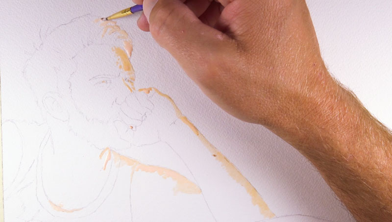
After the masking fluid has dried completely, we can begin adding our first watercolor washes. We'll work quickly in the early stages, keeping the surface wet. By applying wet into wet, we can develop subtle transitions of color as the pigment is pulled by the water on the surface.
The background, along with the paint splatters, is a mixture of Phthalo Blue, Alizarin Crimson, and a touch of Prussian Blue. The skin tone is a mixture of Yellow Ochre, Cadmium Red, and Burnt Umber. The beard is a darker version of the skin tone with a heavier concentration of Burnt Umber and a touch of Prussian Blue.
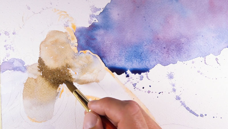

We'll continue to apply several layers of translucent colors. Each application increases the complexity and adjusts the value on the surface as the colors underneath show through the layers applied to the top.
In the shadows, we'll layer a bit of the purple that we mixed for the background in order to harmonize the painting and add interest to the skin tone. We can also add progressively darker applications around the eyes, nose, beard, and hand to define a few details.
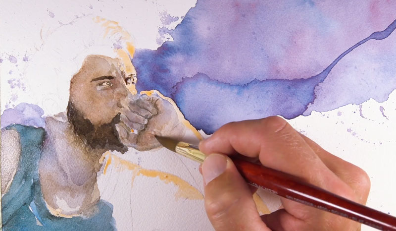
Once our initial watercolor applications have dried completely, we can remove the masking fluid. The masking fluid is removed by rubbing with a finger or by using an eraser.
With the masking fluid removed, we can add the light yellow highlights that contrast the darker purple background. Cadmium Yellow Pale Hue is used on the side of the face, hand, and the upper portion of the collar of the shirt.
Once all of the watercolor applications have dried completely, we can add the line art with pen and ink. A "01" Micron pen is used to apply the ink. Although we could describe the subject by developing a full range of value and texture with pen and ink, a subtle approach is better suited for this image. We don't want to distract the viewer from the expressive watercolor applications. Instead, we'll only use the ink to outline the subject and add minimal texture for the hair and beard.
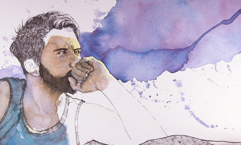
A textural pattern is applied to the sofa in order to add a bit of visual weight and interest. After enhancing line quality on the back of the shirt and the top of the sofa, the image is now complete.