Skip to content
Courses
Lessons
Drawing
Painting
Live Lessons
Lesson Plans
Community
Forum
Critique
Blog
Log In
Dashboard
Join
color theory
What Colors Make Brown? How to Mix Browns
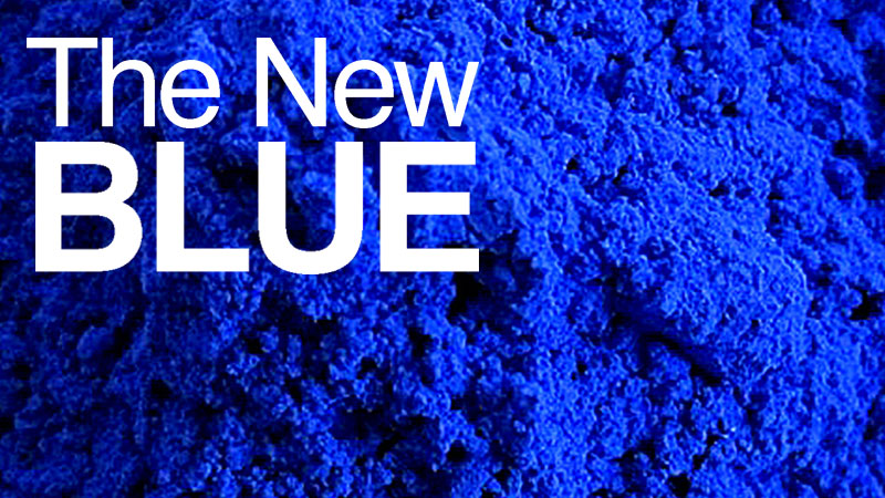
The New Blue – YInMn – A Brilliant Primary is Born
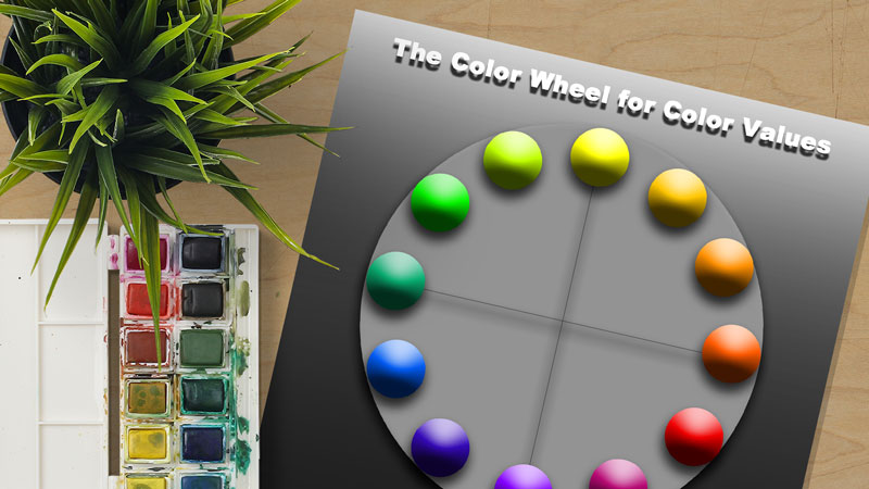
Color Wheel Chart for Values
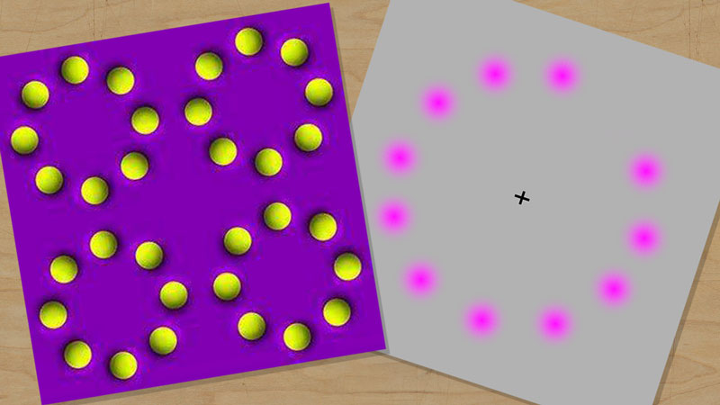
Fun with Complementary Colors
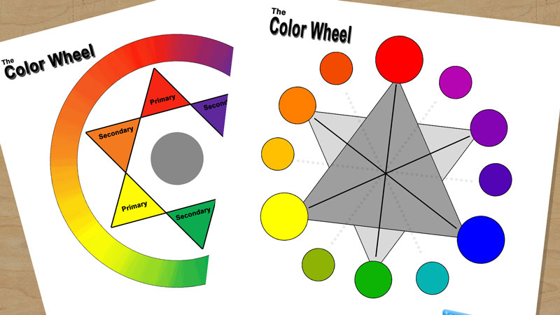
Color Wheel Chart for Teachers and Students
Teach Color Theory with the Interactive Color Wheel