
Photo References – Forms
Photo References – Reflective Surfaces
Photo References – Glass
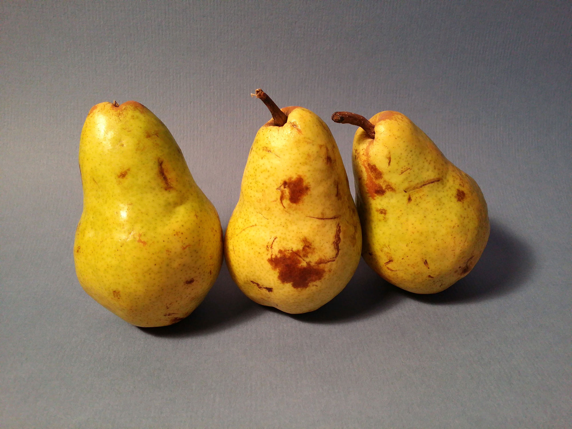
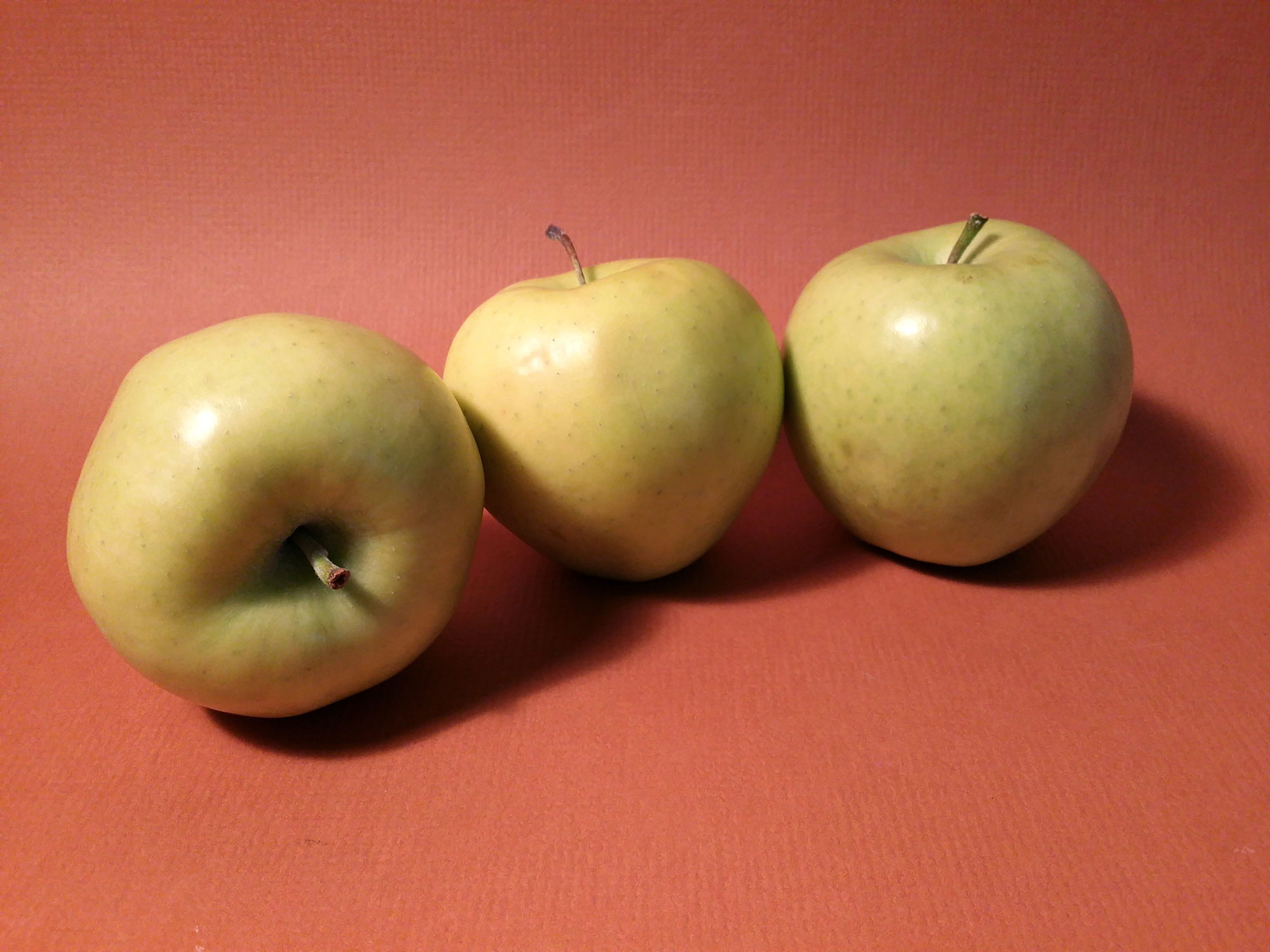
Photo References – Fruit
Still Life Photo References
Before I share these photos with you, I want to talk about the arrangements themselves. The truth of the matter is that if you are working from a photo reference, you are going to be somewhat dependent on the photo itself in regards to the finished drawing or painting. (I know that this may seem a bit obvious, but some people forget this when they are photographing a scene to draw.) If you are taking the photos yourself, and you have control over the arrangement, you should start your compositional planning at that moment. As objects are placed within the scene think about how the finished image will read as a drawing or painting.
Still life arrangements should be harmonious. There should be some sense of continuity in the scene. So how can this sense of unity be achieved? Here are a couple of tips…
Include Multiples
An easy way to create harmony in an image is to include multiples of the same object. Repetition creates unity. So it only makes sense to include multiples of an object when harmony is one of the goals of the still life. Shape and size can also play a role here. If you include similar sizes or shapes of objects, then the objects do not necessarily have to be the same objects. The shape or size of the object can help create a harmonious composition.
Think “3”s
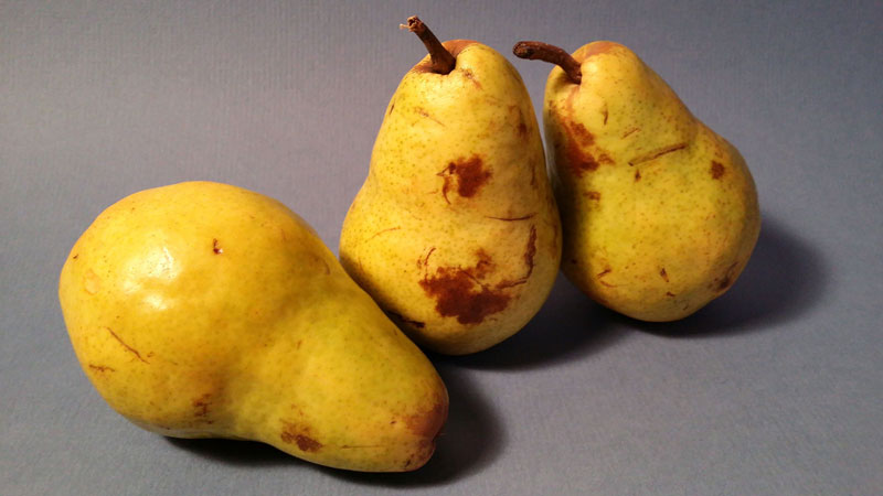
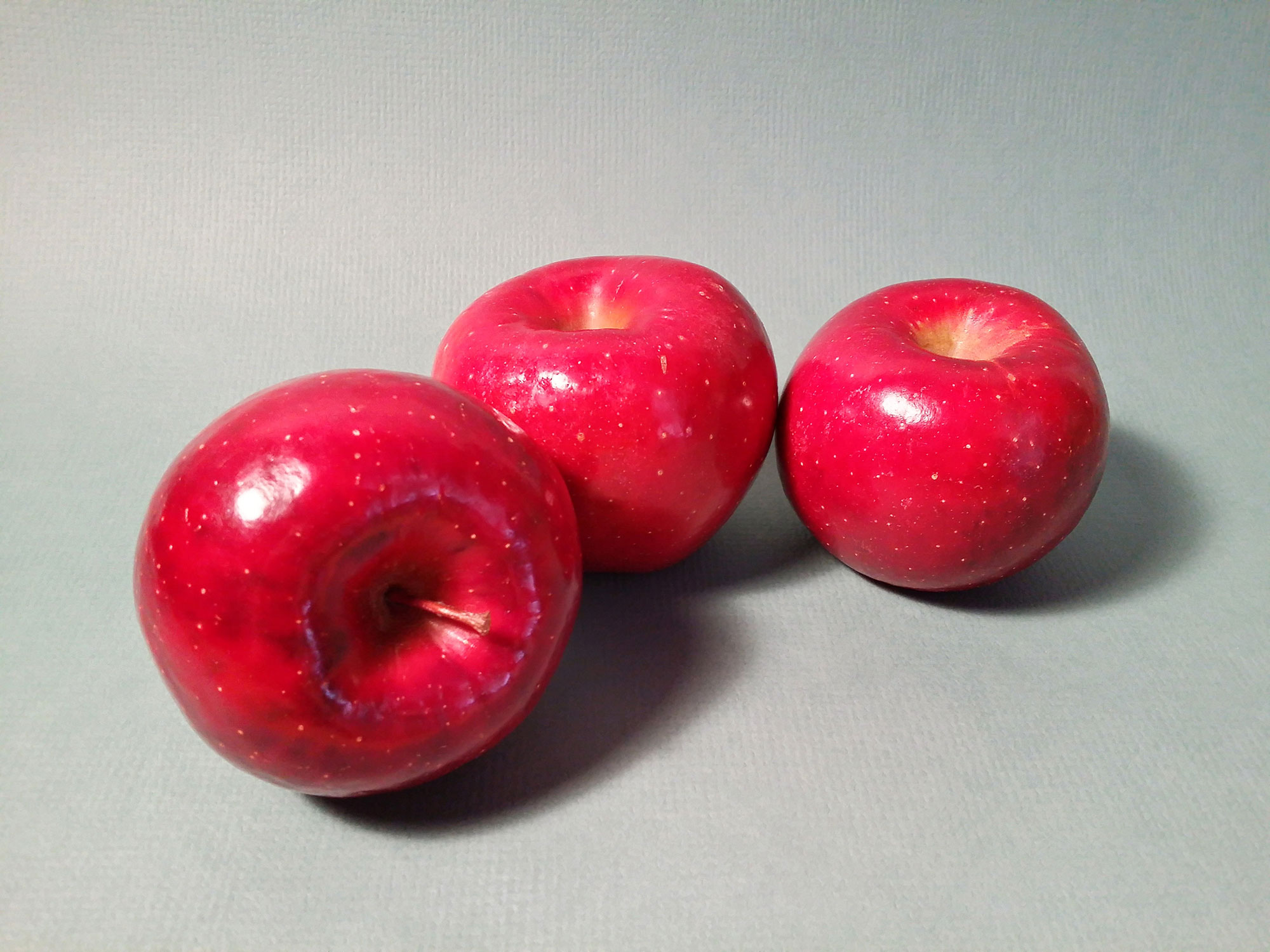
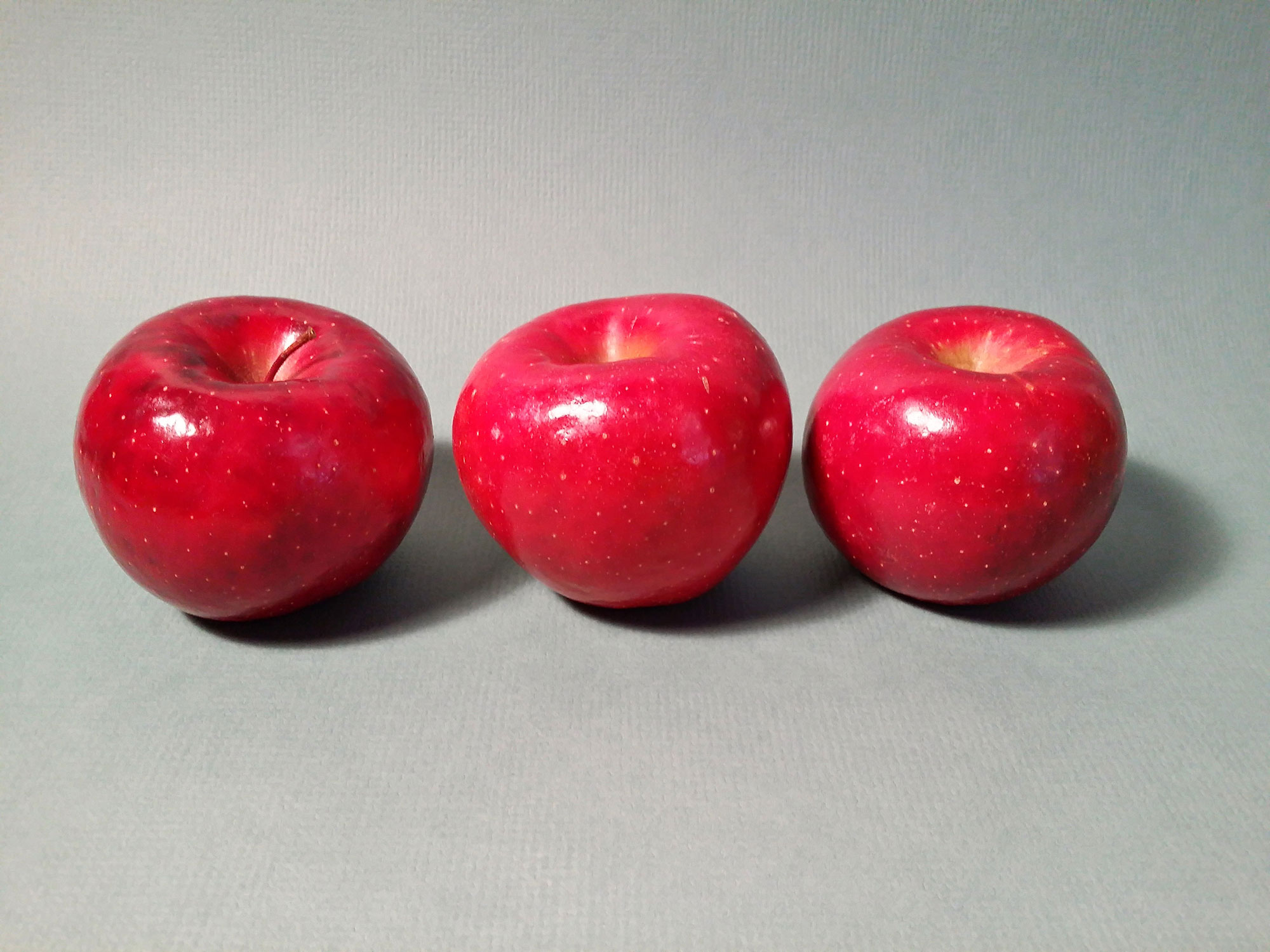
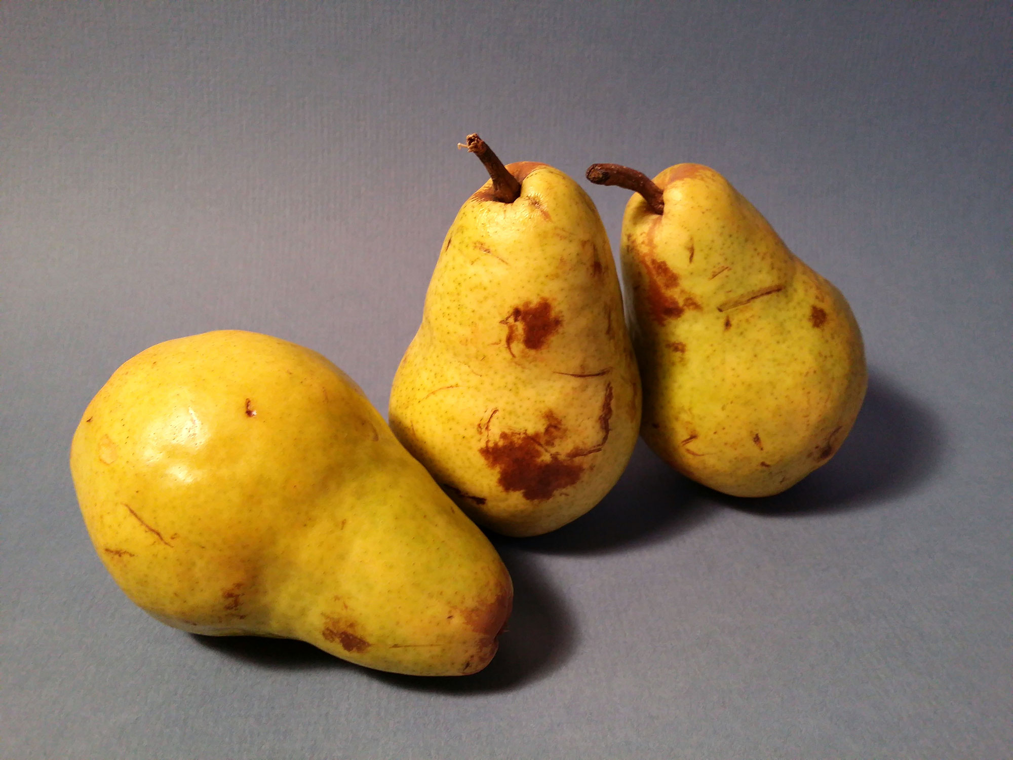
When considering multiples of any object or subject in a composition, think odd numbers. I’m not sure why odd numbers are more aesthetically pleasing – but they are. Consider arranging objects in groups of odd numbers when you photograph so that the drawing or painting that is produced from the photo is compositionally stronger. (The photo references below include arrangements of 3 fruits for this reason.)

Consider a Color Scheme
When working in a colored medium, the scheme in your reference photo will also be a factor. Specific color combinations should be considered when choosing objects and their surrounding environment. A few color schemes that may be considered include analogous, complementary, split-complementary, warm, or cool. I’m not going to go into what each of these schemes entail here, but if you want to learn more about them, you can check out the interactive color wheel.
Variety
Even though your goal should be to create a harmonious scene, you don’t want to create a boring one. Therefore, you may include a bit of variety to the scene. The trick is to create “variety within unity”. In other words, include enough variety to make the still life interesting, but not so much that it becomes stagnant. (When setting up these still life arrangements, I moved a fruit here and there to break up the monotony.)
Ok, enough with the rationale, here’s a look at a few still life photo references for practice. I hope that you are able to find them useful…

If so, join over 36,000 others that receive our newsletter with new drawing and painting lessons. Plus, check out three of our course videos and ebooks for free.


Lesson Discussion
Comments are closed.
Hi Matt ! It is so nice of you to share your artwork.
I love painting and drawing ever since a child.Matt could it be possible
if i order some ebooks of your? If yes then how much would it cost?